How to use AI to review a UX design
By Rosario Meza
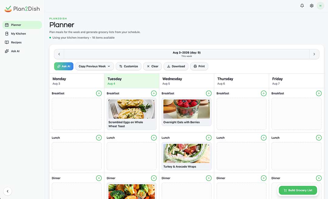
Plan2Dish workflow review
See Case Study- Recipe card. Where would someone look to add just one ingredient?
- Build Grocery List. Is it clear which meals this action includes?
A workflow can look clear in a prototype because the person who designed it already knows what should happen. AI can give you another way to review the draft. I’d start with one moment where a user has to make a decision and ask what information they would have at that point.
Give AI one decision to review
Plan2Dish connects meal planning, kitchen inventory, and grocery shopping. Imagine someone planning taco night. The recipe calls for black beans, and they’re unsure whether they still have a can at home. They want to add the beans to their grocery list without adding the entire recipe. I’d give AI that decision to review and describe exactly what the proposed screen can do.
Someone is reviewing a taco recipe in Plan2Dish. They can add black beans to their grocery list or skip them. The app knows the recipe calls for one can, but the kitchen inventory may be out of date. What would the user need to see before deciding? Suggest two short versions of the copy.
Check what the draft assumes
A draft might say “You’re out of black beans.” That assumes the kitchen inventory is current. The recipe gives us a fact we can use instead. Show “Black beans, 1 can” with an “Add to grocery list” action and let the person decide. If the ingredient is already on the list, check whether the screen can show that before offering to add it again.
Try the revised screen with someone
Ask someone to plan taco night and imagine they’ve just checked the pantry and found no black beans. Watch whether they can add just the beans and tell that they’ve been added. If they try to add all the ingredients, look at whether the two actions are clearly labeled and easy to tell apart.
Two prompts to try in a design review
Check whether the actions are distinct
Review this recipe screen. The user wants to add one ingredient to their grocery list. They can also add every ingredient. Based on the labels and placement, where might someone confuse those actions? Point to the specific elements and suggest one change I can test.
Check what happens after the tap
Compare these screenshots from before and after someone adds black beans to their grocery list. What visible feedback tells them the item was added? How would the screen read if the beans were already on the list? Flag any state you can’t verify from the screenshots.