5 Landing Page Inspiration Sites for Designers
By Rosario Meza
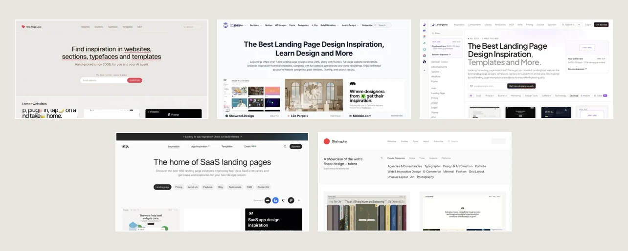
When I start designing a landing page, I like to narrow the search to the decision I’m making. Do I need a stronger hero, a clearer way to explain pricing, or a better place for testimonials? Here are five sites worth bookmarking, with something specific to look for on each.
What is a landing page?
A landing page is a web page designed around a specific visitor action, such as booking a consultation, starting a trial, or downloading a guide. Visitors often arrive from an ad, email, or search result. The page should make the offer clear, answer the questions that might hold someone back, and make the next step easy to find.
1. One Page Love
Planning the flow of a single-page site
Start here when you know what visitors should do but still need to decide how to get them there. Trace one page from its opening promise to its final call to action. Notice where the designer introduces proof, when the main button reappears, and what visitors learn in between.
Sketch the page as a series of boxes and label each with the question it answers. Try the same outline with your own content.
Visit One Page Love ↗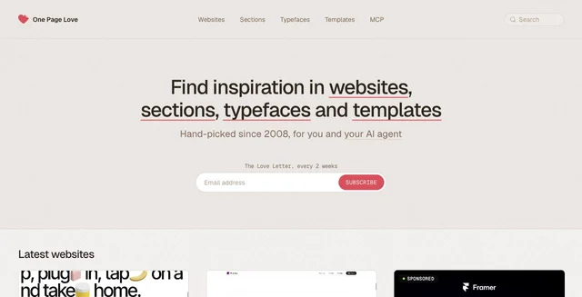
2. Lapa Ninja
Finding examples in a specific industry
Browse a category that matches your project and compare three pages side by side. A service business may lead with what it does and where it works. An e-commerce page may need to show the product, clarify the price, and address delivery questions up front.
Write down one question each page answers in its first screen. Use those notes to decide what your own headline and supporting copy need to cover.
Visit Lapa Ninja ↗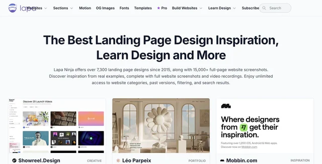
3. Landingfolio
Working through an individual section
Use the section and component examples when the page is mostly defined and one part is giving you trouble. For a hero, compare where the headline, image, and primary button sit. For testimonials, compare how the examples show who is speaking and why their experience matters.
Try two arrangements with your actual copy. See which one makes the next step easiest to find.
Visit Landingfolio ↗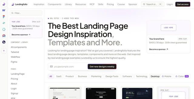
4. SaaS Landing Page
Explaining a software product
This gallery includes software landing pages as well as examples of pricing, features, testimonials, and FAQs. Follow the way a page introduces the product, shows it in use, and answers the questions someone might have before signing up.
Find a product screenshot that makes a feature understandable. Identify what got cropped out, then decide what your own screenshot needs to show.
Visit SaaS Landing Page ↗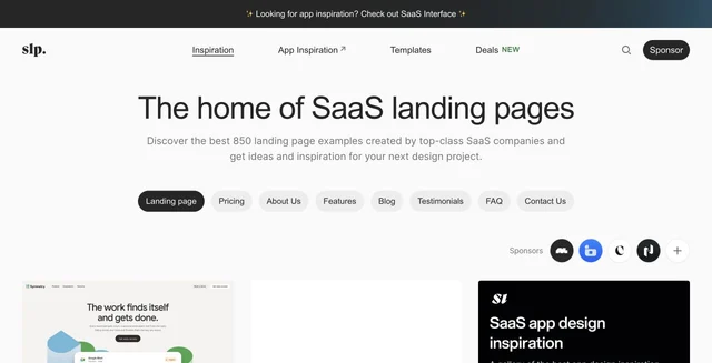
5. Siteinspire
Exploring typography, grids, and art direction
This broader web design gallery is useful when you’re deciding how the page should feel. Browse its typography or grid categories and notice where a layout creates emphasis through type size, spacing, or alignment.
Pick one reference and reduce it to a grayscale sketch. Look at what still draws your eye, then try that hierarchy with your own headline and content.
Visit Siteinspire ↗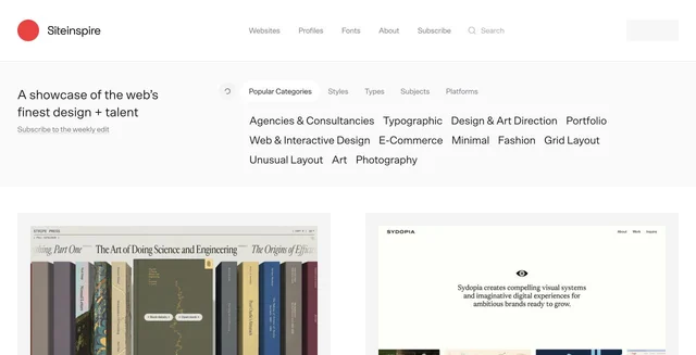
Give your references a job
Save three references and write down one decision you’d borrow from each. One might help you place a testimonial, another might help you show the product, and a third might help you give the primary button more space. Bring those notes into your next wireframe.